
Data visualization for YouTube videos: auto-generate maps, charts, and timelines with AI

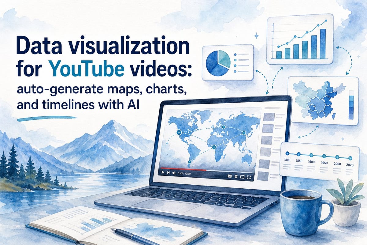
Table of contents
1. Why data visualization transforms long-form YouTube content
2. How AI auto-generates maps, charts, and timelines for your videos
3. Building a scalable production workflow with AI-generated visualizations
If you run a faceless YouTube channel, you already know that visuals carry the video. A narrator explaining population growth is fine. A narrator explaining population growth while a map lights up country by country is memorable. That gap between fine and memorable is exactly where data visualization for YouTube videos does its best work.
The challenge has always been production time. Building a clean animated map, a bar chart race, or a historical timeline from scratch used to require motion graphics software, a skilled editor, and hours of back-and-forth revisions. For solo creators and small teams, that cost is often a dealbreaker. A single animated choropleth map built in Adobe After Effects can take a full afternoon even for someone who knows the software well. Multiply that across a publishing schedule of two or three videos per month and the math simply does not work.
AI changes that math entirely. Today, data visualization YouTube video AI tools can generate maps, charts, and timelines automatically, pulling directly from your script or your data source and slotting them into your video without you touching a single keyframe. The graphics appear at the right moment, sync to the voiceover timing, and match the visual argument your script is making.
This article breaks down how that process works, why it matters specifically for long-form documentary-style content, and how platforms like Kliptory are making high-quality visualization accessible to creators who are building serious channels without a post-production team behind them.
Why data visualization transforms long-form YouTube content
Most people think of data visualization as a design problem. It is really a communication problem. When you are making a 20-minute documentary about the history of global trade routes, or a 15-minute explainer about how inflation has moved across different decades, your audience needs more than words. They need something to look at that makes the numbers real and the relationships between those numbers obvious.
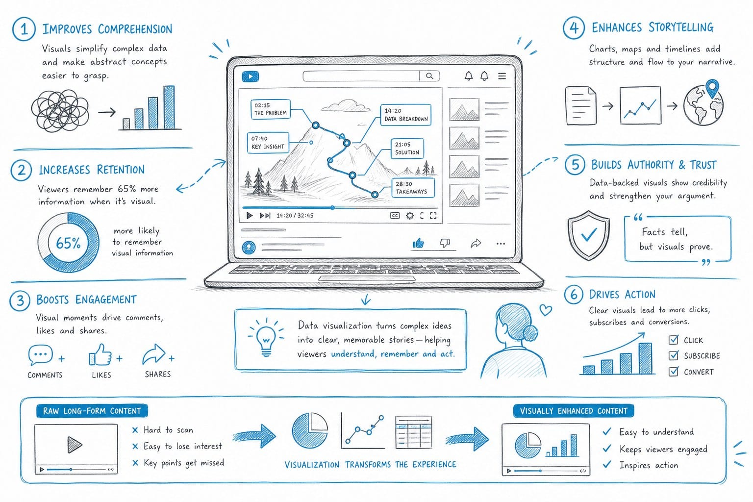
Human brains process visual information faster than text or speech. A well-designed chart showing GDP growth across five countries tells that story in about two seconds. The same information delivered as a spoken list of figures takes twenty seconds to absorb and even longer to remember. For YouTube specifically, that processing speed matters enormously. Viewers who are visually engaged keep watching. Viewers who get bored skip forward or click away entirely, and your audience retention graph shows that drop-off immediately.
Long-form content is especially dependent on strong visuals because it asks more of the viewer. A 30-minute documentary-style video needs variation to sustain attention. You cannot hold an audience with a static talking-head clip or a loop of generic stock footage for half an hour. Maps that animate across time periods, charts that build out as the narrator speaks, and timelines that highlight key events give the viewer something active to follow. They create a visual rhythm that keeps people inside the video rather than scanning the progress bar for something more interesting.
Consider a concrete example. Imagine a video about the spread of the Black Death across Europe between 1347 and 1353. A narrator describing the progression region by region is informative. An animated map that fills in with color as each region is affected, timed exactly to the narration, is viscerally understandable. The viewer does not need to translate words into geography in their head because the geography is right in front of them. That is the difference data visualization makes, and it is not subtle.
There are several specific formats that consistently perform well on faceless YouTube channels. Animated choropleth maps, which shade different regions based on data values, are popular for any geography-heavy content. A video about global literacy rates, trade deficits, military spending, or language distribution all benefits from this format. Bar chart races, where horizontal bars grow and shrink as data changes over time, have become a signature format for historical comparison videos. Viewers find them genuinely engaging because there is always something moving and changing on screen. Timeline graphics work particularly well for biography channels, historical explainer channels, and any content that follows an event-by-event structure. Scatter plots and bubble charts appear in more analytically focused content where the relationship between two variables is the core argument.
These are not novelty formats. They have become standard because they match the way people naturally understand two fundamental concepts: change over time and comparison across categories. Any video topic that involves either of those concepts is a candidate for data visualization, which covers a substantial portion of what faceless YouTube channels actually cover.
The production barrier has always been the limiting factor. Creating an animated choropleth map traditionally means working with tools like Adobe After Effects, D3.js in a code environment, or Flourish, each of which requires either significant technical skill or a steep learning curve. A single polished animated map built from scratch can take three to five hours for someone who already knows what they are doing. For someone learning the tool while building the asset, that number doubles. For a solo creator publishing regularly, that time cost is not manageable.
The economic reality is that the time spent building one animated map could be spent researching and scripting the next video, engaging with the community, or optimizing titles and thumbnails. These are activities that directly move a channel forward. Frame-by-frame animation work, as satisfying as it can be, does not scale with a small team or a solo operation.
This is the core reason that data visualization YouTube video AI tools have become genuinely useful rather than just technically impressive. They solve a specific, real production bottleneck that was previously only solvable by hiring a motion graphics editor or investing weeks in learning professional animation software. Removing that bottleneck does not just save time on a single video. It changes what is possible for an entire channel's output and visual quality over the long run.
There is also a competitive dimension worth acknowledging. Faceless YouTube channels in topics like history, economics, geography, science, and finance are not a small niche. There are thousands of channels covering overlapping topics, and the ones that retain viewers and grow consistently tend to be the ones that invest in visual quality. A channel that regularly uses animated maps and chart sequences looks more authoritative and more professional than one that relies entirely on stock footage. Viewers may not consciously articulate this, but they respond to it. Watch time data and subscriber growth rates reflect the difference.
Data visualization is not a gimmick or a trend. It is a communication tool that makes complex information clearer and more memorable, and it is directly correlated with the kind of engagement metrics that YouTube rewards. The only question has been whether it is accessible enough for the creators who need it most. AI is making the answer yes.
How AI auto-generates maps, charts, and timelines for your videos
The phrase AI-generated visualization can mean several different things depending on the tool, so it is worth being specific about what actually happens in a modern AI production workflow rather than speaking in vague terms about what the technology can theoretically do.
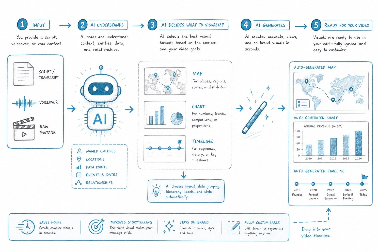
At the most basic level, AI visualization tools parse your script or your structured data input and make decisions about what type of graphic best fits the content at each point in the video. If your script mentions a series of countries and compares them on a specific economic metric, the system recognizes that pattern and generates a comparative bar chart or a choropleth map. If your script walks through a sequence of dated events, it identifies the timeline structure and builds a timeline graphic. If your script makes a claim about how a single metric has changed over a multi-decade period, it generates a line chart or bar chart that covers that range.
This is pattern recognition applied to structured content, and it works reliably when the content itself is well-organized. The AI is not inferring meaning from ambiguous prose. It is identifying explicit numerical claims, geographic references, date ranges, and comparative structures, then selecting the appropriate visualization format for each one. When the script gives it clean inputs, the output is clean. When the script is vague or conversational, the system has less to work with.
Kliptory handles visualization as part of its broader automated production process rather than as a separate add-on tool. When you feed a script into the platform, it does not just handle the voiceover and the B-roll selection. It identifies segments of the script where a data visualization would strengthen the argument and generates that graphic with the correct timing built in from the start. You are not toggling between five different applications or manually flagging every chart opportunity and then re-syncing everything after the fact.
For maps specifically, the AI approach eliminates the most labor-intensive part of the traditional process. Building an animated map manually means acquiring geographic boundary data, setting up a rendering environment, defining the animation sequence, calculating timing markers against the audio track, and then rebuilding everything if the script changes at any point. With an AI-driven system, all of that happens automatically. If the script says the Mongol Empire expanded from Central Asia to Eastern Europe between 1206 and 1279, the map animates the correct geographic regions across the correct timeframe and syncs to the voiceover without you touching the timing manually.
Bar chart races work similarly. The inputs are date ranges, category labels, and numerical values. The AI handles the animation logic, the pacing between time steps, the visual formatting of labels and axes, and the overall sequencing. You define the data and the story you are telling with that data. The system builds the visual that communicates it. For a video comparing the military spending of major powers from 1950 to 2020, the creator does not need to build seventy years of animation frame by frame. They define the data, and the system renders the race.
Timelines are arguably the most overlooked visualization type among creators who are not thinking visually by default. A clean animated timeline can organize a biography, a legislative history, a corporate evolution, or a military campaign in a way that spoken narration alone cannot replicate. When the narrator says and in 1969, the first message was sent over ARPANET, a timeline that highlights that event visually gives the viewer an anchor they can hold onto as the story continues to develop. AI tools can extract event sequences directly from a structured script and render them as timelines that match the voiceover pacing without any manual timing work.
One practical detail worth understanding is how AI visualization tools handle data that is not explicitly stated in the script. Some platforms allow you to upload a spreadsheet or connect to a data source, and the system generates visualizations from that structured data while the script provides the narrative context. Others work exclusively from the text of the script itself. Both approaches have their place. Script-based visualization is faster and more integrated into the writing workflow. Data-upload visualization gives you more precision when you have already assembled a clean dataset for a research-heavy video. The best workflows often combine both depending on the type of content.
For creators who want to understand how Kliptory handles the full production pipeline beyond just visualizations, the breakdown at AI B-roll sourcing for YouTube: automatically match visuals to your script explains how visual elements get matched to script content automatically. The logic that drives B-roll placement and the logic that drives visualization placement are closely related. Both involve the system identifying what is being said at a given moment and selecting the most appropriate visual asset to accompany it.
The quality of the underlying content still matters significantly in this workflow. AI visualization tools are not capable of inventing data that your script does not reference or that you have not uploaded. They cannot make a poorly researched video look well-researched. What they can do is take accurate, specific, well-organized content and render it visually at a speed and quality level that would otherwise require specialized skills. The creator's responsibility is the research, the accuracy, and the structural clarity of the script. The AI handles the visual execution.
There is also a feedback quality that develops over time as you build more videos using AI visualization tools. You start to write scripts differently. You begin including more specific numbers, more explicit comparisons, and more geographic references because you know that each of those details is an opportunity for a visual that strengthens the argument. The writing and the visualization process start to reinforce each other, and the videos become more informative and more visually engaging at the same time. This is not a side effect of the technology. It is one of the most useful discipline effects it creates.
For creators who are also evaluating the voiceover component of their production workflow alongside the visualization question, AI voiceover for YouTube videos: best tools for faceless channels covers the audio side of automated production in comparable depth. The two workflows integrate naturally because both are timed to the same script, and having them in the same production environment means the timing synchronization happens automatically rather than requiring manual coordination between separate exports.
Building a scalable production workflow with AI-generated visualizations
Understanding what AI visualization tools can do is useful. Understanding how to build them into a repeatable workflow is what actually changes your output as a creator over time. A single impressive video using AI-generated maps is a proof of concept. A consistent publishing schedule where every video has strong animated visuals is a competitive channel strategy.
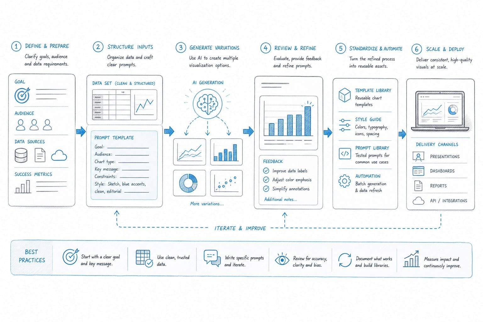
If you are running a faceless channel and want to publish with consistency and quality, the goal is not to use AI visualization for one video as an experiment and then return to your previous process. The goal is to restructure your production process so that AI handles the technical execution at every stage, freeing your time for strategy, research, and creative direction. Here is how that process looks when it is built correctly from the beginning.
Start with the visual argument, not just the topic
Most creators begin with a topic and then write a script. A more effective approach for data-heavy content is to begin with the visual argument and then write a script that supports it. A video about the decline of manufacturing employment in the United States is a topic. The visual argument is that manufacturing employment as a share of total jobs dropped from 26 percent in 1970 to 8 percent in 2023, with the steepest decline happening between 1979 and 1983 and again between 2000 and 2010. That visual argument immediately tells you that you need a line chart covering five decades, potentially with annotations marking the key inflection points.
When you identify the visual argument before writing, your script naturally contains the specific dates, percentages, country names, and comparisons that AI visualization tools need to generate accurate graphics. The two processes reinforce each other. You end up with a better script and better visuals because you thought about both at the same time rather than treating visualization as something you figure out after the script is done.
Write scripts that give the AI specific inputs
Vague references to things like a dramatic increase in renewable energy capacity or significant growth in the region are difficult for AI visualization systems to work with because there is no number, no time frame, and no geographic scope. These phrases are common in early drafts because writers reach for them naturally. They are less work to write than specific claims, and they feel authoritative enough on the surface.
The problem is that they produce no visualization opportunity. There is nothing for the system to render because there is no specific data point. Replace vague language with explicit claims: global solar capacity grew from 40 gigawatts in 2010 to over 1,100 gigawatts in 2022, with China, the European Union, and the United States accounting for roughly 70 percent of that growth. That sentence contains a time range, a starting value, an ending value, and a geographic breakdown. The AI can generate a line chart from 2010 to 2022 and a pie chart or grouped bar chart showing the geographic distribution. Two visualizations from one sentence, automatically, because the inputs were specific.
This discipline takes practice but becomes second nature quickly. Specific language is also better for the audience, not just for the AI. Viewers remember numbers and places. They do not remember vague characterizations.
Run the production process through an integrated platform
This is where the difference between using a collection of separate tools and using an integrated platform like Kliptory becomes concrete. When scripting, voiceover generation, B-roll sourcing, caption creation, and data visualization are all handled within the same system, the timing and synchronization happen automatically. The chart that illustrates a specific claim about, say, China's share of global manufacturing output appears at the exact moment in the video when that claim is made in the voiceover. The system knows when the claim occurs because it processed the script. It knows how long to hold the visualization because it knows the duration of that segment in the audio.
When you are doing this across five separate tools with five separate export workflows, you are manually reconciling all of that timing. A script change means re-exporting the audio, recalculating the timing markers, adjusting the animation sequence in your graphics tool, and re-importing everything. With an integrated workflow, a script change propagates through the entire production automatically. That is not a minor convenience. It is the difference between an afternoon of revision work and a few minutes.
For a broader look at how this kind of scaled production operates without adding headcount, the article on how to scale a YouTube channel without hiring editors goes into detail on the staffing and workflow side of high-volume faceless channel production. The core argument there applies directly to the visualization question: the creators who scale successfully are the ones who invest in systems rather than in additional labor.
Review and refine with a critical eye
AI-generated visualizations are strong starting points, but they are not always perfect on the first pass, and treating them as finished work without review is a mistake. The review step is where your editorial judgment adds value that the system cannot replicate on its own. You may need to adjust the color palette to match your channel's visual identity. You may want to extend the animation duration on a particularly important chart so that viewers have more time to absorb what they are seeing. You may decide that a specific segment calls for a different visualization type than the one the system selected.
These are creative decisions that require a human eye. But they are decisions made on a solid foundation rather than from a blank canvas, and that difference dramatically reduces the time required. Reviewing and adjusting a well-generated visualization takes minutes. Building the same visualization from scratch takes hours. The AI handles the construction. You handle the creative refinement.
Good review also means checking factual accuracy. The AI renders what the script says. If the script contains an error, the visualization will contain that error visually, which makes it more prominent rather than less. Verifying your data before the script is finalized is the correct point to catch mistakes. By the time the visualization is generated, the source data should already be confirmed.
Track retention data and let it shape your next production
YouTube Analytics gives you audience retention curves for every video you publish. Over time, patterns emerge. Videos with animated maps and chart sequences in their middle sections tend to retain viewers through content that might otherwise produce drop-off. The sections of a long video where visualizations appear often show a flatter retention curve, meaning viewers are engaged rather than skipping. Sections without strong visuals, particularly in the 10-to-20-minute range of a long-form video, are where drop-off concentrates.
This data is specific to your channel and your audience, which means it is more actionable than any general advice about what works on YouTube. If your retention data shows that viewers consistently drop off during a particular type of segment, and that segment currently lacks a strong visual element, that is a clear signal. Adding a timeline or a chart to that segment in the next video is a testable hypothesis, and you will know within a few weeks whether it moved the needle.
This feedback loop, where retention data informs your next production decision, is one of the most valuable aspects of building a data-driven channel. It turns each video into a source of information about what your audience responds to, and it gives you specific, actionable improvements to make rather than vague intuitions about what might work better.
The real payoff is scalability
A solo creator using an integrated AI production platform can realistically produce multiple long-form documentary-style videos per month, each with animated maps, chart sequences, timelines, voiceover, and captions. Without AI, that same output would require a team consisting of at least a scriptwriter, a voiceover artist, a motion graphics editor, and a video editor. The cost difference is substantial. The speed difference is equally significant. For anyone building a YouTube channel as a serious income source rather than a casual project, that gap in production capacity is one of the most important variables in the business.
The creators who get the most out of AI visualization tools are the ones who treat them as infrastructure rather than inspiration. They build scripts that are visualization-friendly from the first draft. They choose topics that have clear data stories at their core. They review AI outputs with a critical and informed eye rather than publishing the first result. And they use the time they save on technical execution to do more research, more strategic topic planning, and more thoughtful audience development.
The quality of the idea still comes from you. A poorly researched video with beautiful animated maps is still a poorly researched video. Viewers recognize thin arguments regardless of production polish. What AI visualization tools remove is the production tax on strong ideas. If you have done the research and you have something genuinely worth communicating, these tools let you communicate it at a visual quality level that was previously out of reach for a solo creator. That is the actual value proposition, and it is significant.
Ready to take the next step?
If you are ready to stop skipping data visualizations because they take too long to produce, Kliptory can build them automatically as part of your full video workflow. Visit kliptory.com to see how the platform handles maps, charts, timelines, voiceover, and everything else your long-form channel needs to compete and grow.