YouTube Video Thumbnail Sizes: The Complete Guide
If you've ever uploaded a video to YouTube and watched it get ignored, there's a good chance your thumbnail had something to do with it. Thumbnails are the first thing people see, and they decide in a split second whether to click or keep scrolling. Getting the size right is the foundation of making a thumbnail that actually works. A blurry or stretched image tells viewers your content might not be worth their time, even before they've seen a single second of it.
A lot of you have asked about this exact topic, and it makes sense because the rules around thumbnail sizes aren't always obvious. YouTube doesn't always make it easy to find this information in one place, and there's a lot of bad advice floating around online. So let's break it all down clearly, starting with the basics and moving into the details that can actually make a difference for your channel.
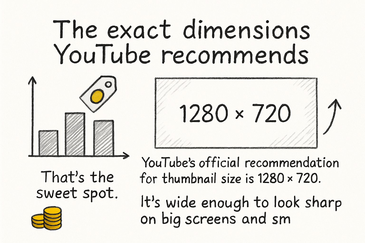
The exact dimensions YouTube recommends
YouTube's official recommendation for thumbnail size is 1280 x 720 pixels. That's the sweet spot. It's wide enough to look sharp on big screens and small enough to load quickly without slowing anything down. The minimum width is 640 pixels, but you really don't want to go that small unless you have no other choice. Anything smaller starts looking soft and low quality on modern displays.
The aspect ratio you need to keep in mind is 16:9. That's the standard widescreen ratio that YouTube uses for its video player, and your thumbnail should match it. If you upload something in a different ratio, YouTube will either stretch it or add black bars around the edges, and neither of those looks good. Stick to 16:9 and you'll avoid that problem entirely.
For file size, YouTube caps thumbnails at 2MB. Most image editors will let you export a 1280 x 720 image well under that limit, so it's rarely a problem. As for file types, YouTube accepts JPG, PNG, GIF, and BMP. JPG is usually the best choice because it keeps the file size small while still looking clean. PNG works well too, especially if your design has text or sharp edges that need to stay crisp.
I personally think PNG is underrated for thumbnails with a lot of text, because JPG compression can sometimes make words look a little fuzzy around the edges. It's a small thing, but it adds up when someone's viewing your thumbnail at a small size in their feed.
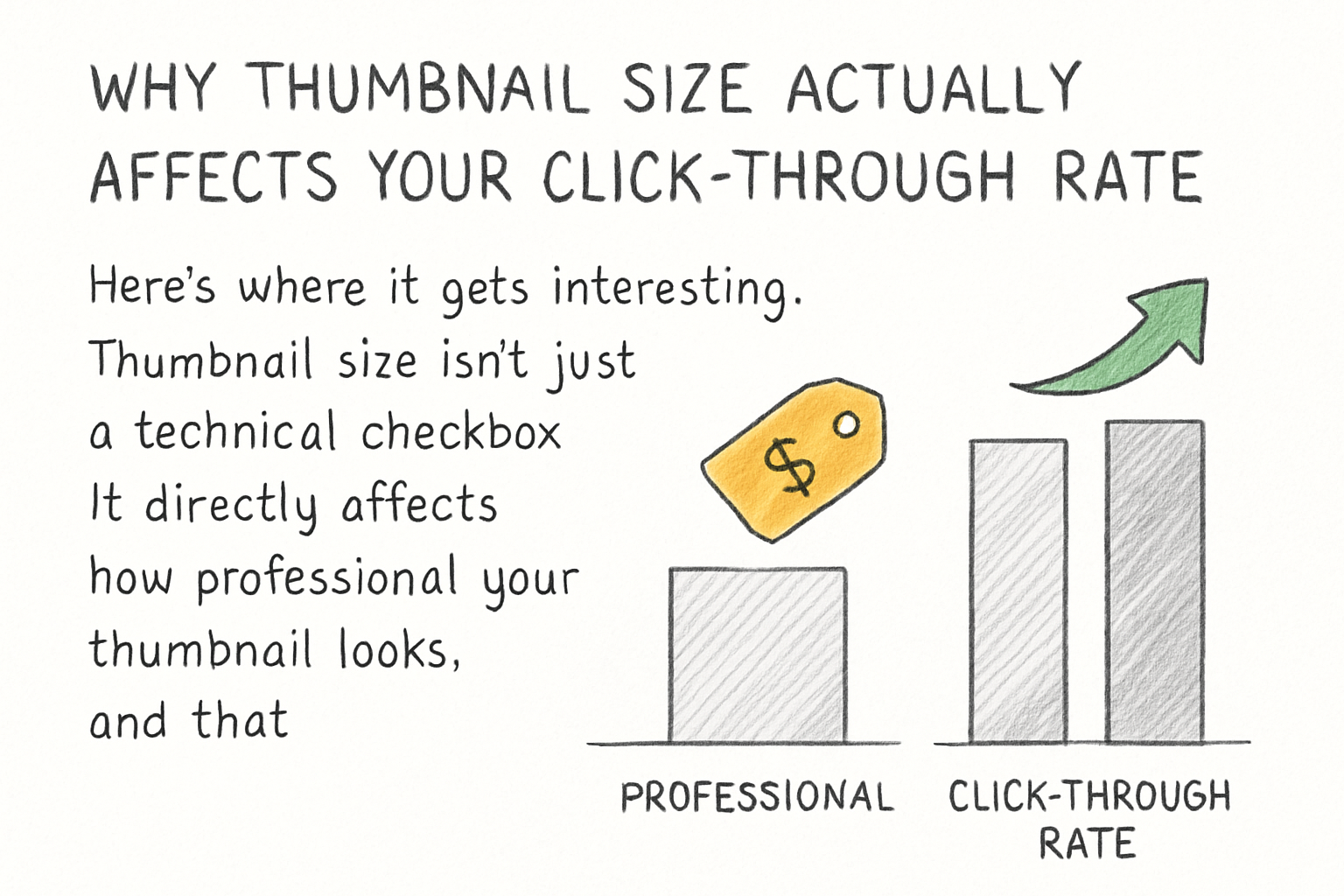
Why thumbnail size actually affects your click-through rate
Here's where it gets interesting. Thumbnail size isn't just a technical checkbox. It directly affects how professional your thumbnail looks, and that matters a lot to viewers. When someone is browsing YouTube, they're making quick decisions. A sharp, well-sized thumbnail signals that you put effort into your content. A pixelated or oddly cropped one does the opposite.
YouTube displays thumbnails in a bunch of different places, and they don't always show up the same size. On the home feed on a desktop, thumbnails are fairly large. On mobile, they're smaller. In suggested videos on the right side of the screen, they're even smaller. Your thumbnail needs to look good at all those sizes, which is why starting at 1280 x 720 gives you room to scale down without losing quality.
This is also why text on thumbnails needs to be big and bold. If you're adding words to your thumbnail, they have to be readable even when the thumbnail is the size of a postage stamp. A lot of creators make the mistake of adding small text that looks fine on their design screen but disappears completely when someone sees it in their feed on a phone.
Think about how your thumbnail will look on a mobile screen, because that's where a huge chunk of YouTube's traffic comes from. If the text is hard to read and the image is too busy, people scroll right past it. Keeping things simple, bold, and well-sized will help your thumbnail do its job across every device.
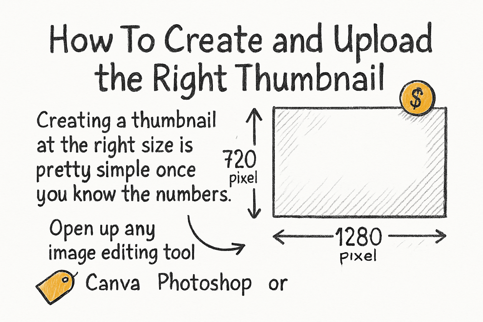
How to create and upload the right thumbnail
Creating a thumbnail at the right size is pretty simple once you know the numbers. Open up any image editing tool, whether that's Canva, Photoshop, or even a free option like GIMP, and set your canvas to 1280 x 720 pixels before you start designing. Starting with the right canvas size from the beginning saves you from having to resize later, which can mess up your layout or blur your image.
When you're designing, try to keep the main subject of your thumbnail on one side and leave room on the other for text or a title. YouTube sometimes overlays the video duration in the bottom-right corner, so avoid putting anything important there. Also, the bottom-left area is where YouTube places the channel info for some recommendations, so keep that in mind too.
Once you're happy with your design, export it as a JPG or PNG and check the file size before uploading. If it's over 2MB, most tools have an option to reduce quality slightly or compress the image. Once it's ready, go to YouTube Studio, open the video you want to update, scroll down to the thumbnail section, and upload your file. YouTube will save it and start using it right away.
If you're working on growing your YouTube presence and want to think more carefully about your video production overall, it's worth reading up on visual storytelling in general. We actually covered scripting and visual planning in our guide on writing a documentary script, and a lot of those ideas carry over to how you frame your thumbnail visuals too. Good thumbnails and good storytelling go hand in hand.
Ready to take the next step?
Getting your thumbnail size right is one of the easiest wins available to any YouTube creator. It takes maybe five extra minutes to do it properly, and the difference it makes in how your content is perceived is real. If you're ready to take your YouTube game further and want tools that actually help you work smarter with video content, check out Kliptory and see what it can do for you. And if you have questions about thumbnails or anything else we covered here, drop them in the comments below. We read every single one.